METHOD METALLICS LIMITED EDITION COLLECTION
CREATIVE STRATEGY | PACKAGING DESIGN | CAMPAIGN ART DIRECTION | VISUAL DESIGN
SHINE BRIGHT LIKE A DIAMOND
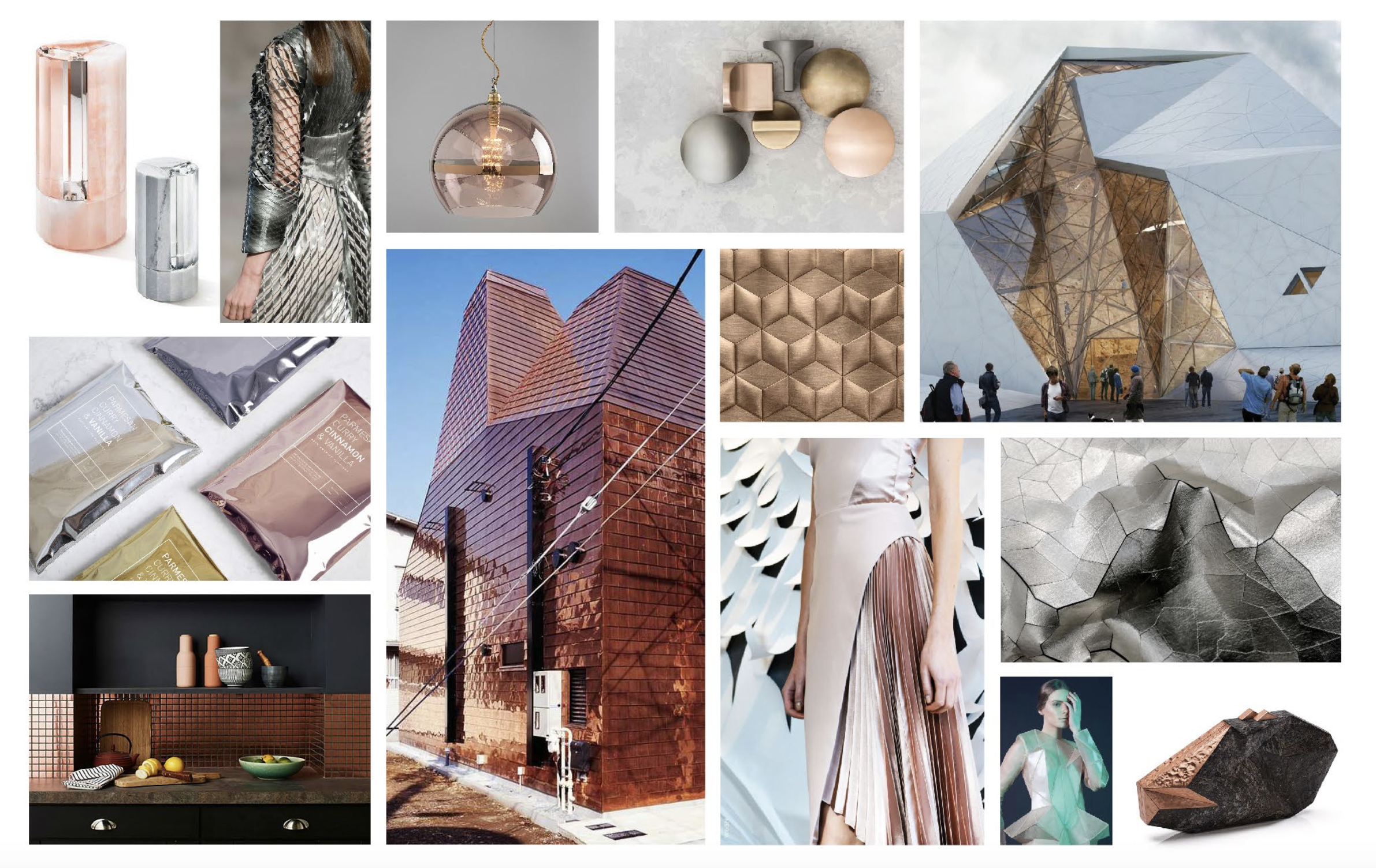
Every six months, method launches a new limited edition collection designed and developed by the creative leads on their in-house design team. Inspired by the evolving cityscape of San Francisco, I designed this limited edition collection, with high-shine surfaces to compliment finishes found in kitchen and bathroom décor, where these bottles would live in home. The geometric patterns are actually thin, clear windows in the otherwise opaque designs, allowing light to flow through, creating a lit-from-within effect. We partnered with Athena Calderone to bring this collection to life on our site and through our social channels. I carried the design inspiration of the bottles through to the visual design of the collection landing page, allowing online shoppers to see how these products would compliment their own home décor.
INSPIRATION MOOD BOARD
PACKAGING DESIGN
VISUAL DESIGN, PRODUCT LANDING PAGE


